Shopify's New Style Settings: Flexibility at Your Fingertips

What I’ve been thinking about:
Shopify has recently introduced a game-changing feature in the Flex sections developer preview—Style settings. This enhancement empowers developers with greater control over the design of Shopify themes by providing adaptable style properties that can respond to different breakpoints. Here's a deep dive into what these settings offer and how to leverage them in your themes.
What Are Style Settings?
Style settings are a new category of input settings designed to hold values that map directly to CSS properties. Unlike traditional input settings, these can hold different values for various breakpoints, ensuring responsive and flexible design control.
Categories of Style Settings
There are two primary categories:
- Style Panel Settings: Pre-organized by Shopify, these settings map to common CSS property categories such as layout, size, and spacing.
- Style Input Settings: Coming soon, these settings will allow values adaptable by breakpoint, tied directly to specific CSS properties.
Exploring Style Panel Settings
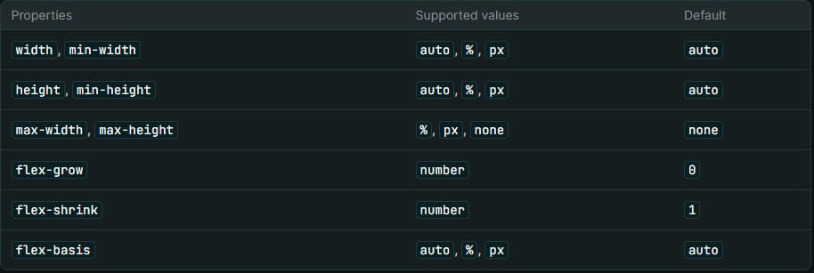
Size Panel
The style.size_panel controls the width and height of elements. Here’s a quick example:
{
  "type": "style.size_panel",
  "id": "size",
  "label": "Size",
  "default": {
    "width": "25%",
    "height": "auto"
  }
}
Supported properties include:
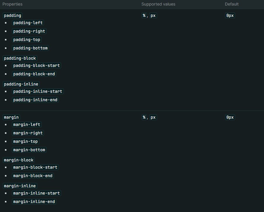
Spacing Panel
The style.spacing_panel manages padding and margin:
{
  "type": "style.spacing_panel",
  "id": "spacing",
  "label": "Spacing",
  "default": {
    "padding": "16px 2px",
    "margin": "0px"
  }
}
It supports shorthand and longhand properties for padding and margin, ensuring flexibility and precision.
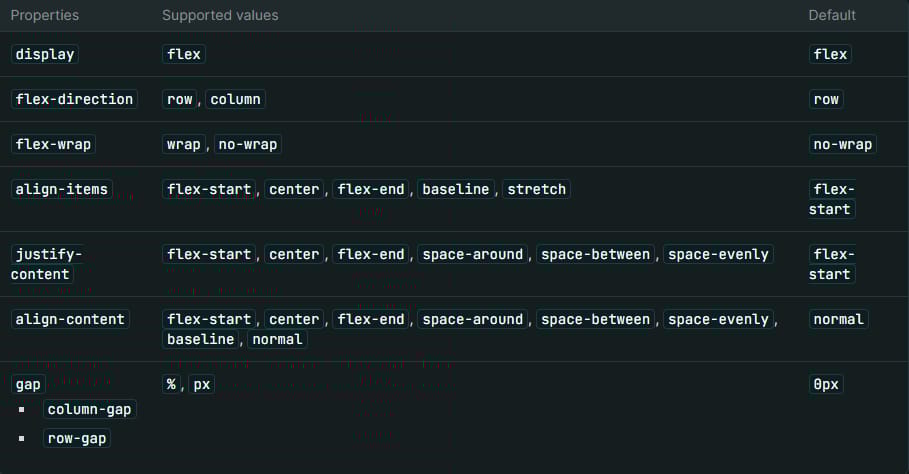
Layout Panel
The style.layout_panel controls layout properties such as direction, positioning, and alignment:
{
  "type": "style.layout_panel",
  "id": "layout",
  "label": "Layout",
  "default": {
    "display": "flex",
    "flex-direction": "row",
    "flex-wrap": "wrap",
    "gap": "20px",
    "justify-content": "flex-start",
    "align-items": "center"
  }
}
Supported properties include:
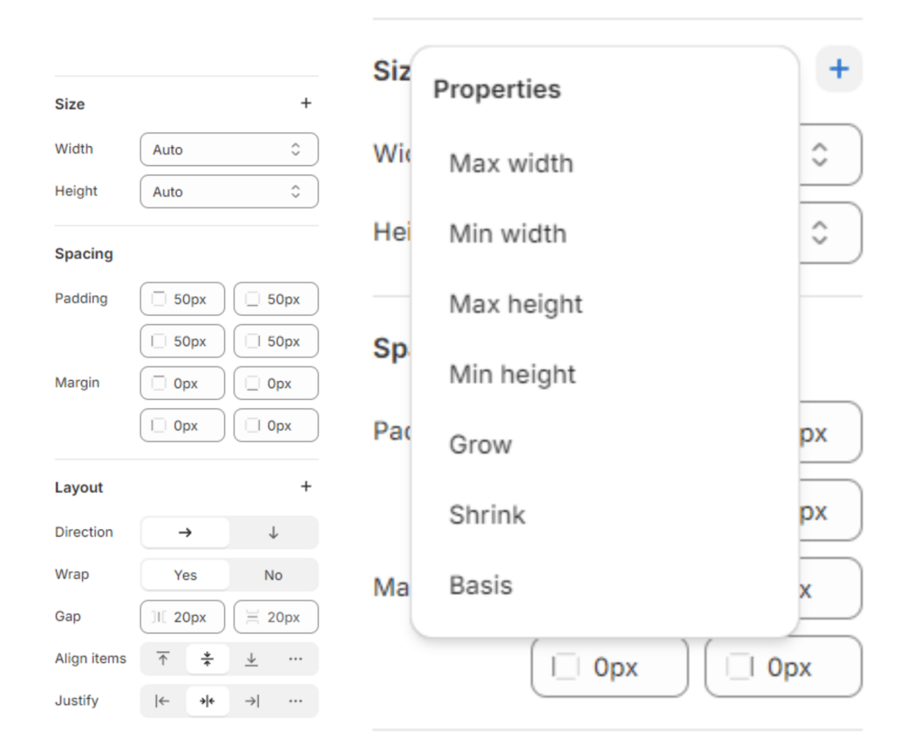
Here is a preview of the settings within the Theme Customizer. The values shown are the default ones you set, and you can easily add other supported properties by clicking the ‘+’ icon.
Utilizing Style Settings
Accessing Style Settings
You can access these settings in Liquid using the id attribute:
Theme settings:
Section:
Block:
Applying Style Settings
Use the class_list filter to apply style settings to elements:
<div class=”wrapper {{ block.settings.spacing | class_list }}”>
  <div class="group {{ block.settings.layout | class_list }}">
    {% content_for “blocks” %}
  </div>
</div>
{% schema %}
{
  "name": "Group",
  "blocks": [{"type": "@theme"}, {"type": "@app"}],
  "settings": [
    {
      "type": "style.layout_panel",
      "id": "layout",
      "label": "Layout",
      "default": {
        "flex-direction": "column"
      }
    },
    {
      "type": "style.spacing_panel",
      "id": "spacing",
      "label": "Spacing",
      "default": {
        "padding": "20px"
      }
    }
  ]
}
{% endschema %}
This method ensures that default values and merchant edits are applied consistently.
You can also apply all of the block or section settings to a single element by doing the following:
<div class="group {{ block.settings | class_list }}">
  {% content_for “blocks” %}
</div>
{% schema %}
{
  "name": "Group",
  "blocks": [{"type": "@theme"}, {"type": "@app"}],
  "settings": [
    {
      "type": "style.layout_panel",
      "id": "layout",
      "label": "Layout",
      "default": {
        "flex-direction": "column"
      }
    },
    {
      "type": "style.spacing_panel",
      "id": "spacing",
      "label": "Spacing",
      "default": {
        "padding": "20px"
      }
    }
  ]
}
{% endschema %}
Breakpoint-Specific Values
You can specify different values for different breakpoints using media queries. For instance:
jsonCopy code
{
  "type": "style.spacing_panel",
  "id": "spacing",
  "label": "Spacing",
  "default": {
    "padding": "20px",
    "margin": "10px",
    "@media (--mobile)": {
      "padding": "10px",
      "margin": "0px"
    }
  }
}
Currently, only the mobile breakpoint is available, but more will be introduced soon.
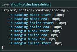
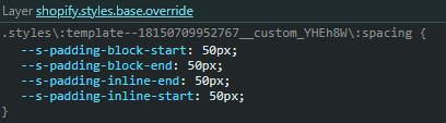
Previewing Your CSS
Here, you can see all the default properties populated, as well as any properties you have overridden.

Conclusion
Shopify’s new Style settings bring a new level of customization and responsiveness to theme development. By leveraging these settings, developers can create more adaptable and visually appealing themes that cater to various device sizes and merchant preferences. Stay tuned for more updates as Shopify continues to enhance these capabilities! You can find more info in the Shopify Documentation.


Shopify Expert?


.svg)


.svg)
